


Super User
วันอาทิตย์, 31 กรกฎาคม 1554 13:30
Media Player
The Widgetkit Media Player is a HTML5 audio and video player completely built HTML and CSS. You can easily embed video files into your website by using the HTML5 video element. A Flash player fallback is included for all unsupported browsers.
Features
- Native playback for modern HTML5 browsers
- Supports MP4 (h.264), WebM, FLV, WMV and MP3 files
- Completely built with HTML and CSS
- Same UI in all browsers
- Create your own skins
- Flash player fallback for unsupported browsers
- Works with Joomla and WordPress
Examples
This is a MP3 Audio Sample:
How To Use
Use the HTML5 video element to embed video in your website. For example:
<video src="/video.mp4" width="320" height="240"></video>
You can also provide multiple sources, to add support for the different video formats like h.264, WebM or Ogg:
<video width="320" height="240">
	<source type="video/mp4"  src="/video.mp4" />
	<source type="video/webm" src="/video.webm" />
	<source type="video/ogg"  src="/video.ogv" />
</video>
Use the HTML5 audio element to embed MP3 files in your website. For example:
<audio src="/audio.mp3" type="audio/mp3"></audio>
เผยแพร่ใน
Uncategorised
ใช้แท็กคำค้น (Tags) ว่า
วันพุธ, 08 มิถุนายน 1554 16:35
Twitter
The Widgetkit Twitter module is the neatest way to display tweets directly on your website. All displayed tweets get cached so they show up super fast, even if Twitter is not available.
Features
- Filter tweets by hashtags, words, from users, to users, referencing users
- Block tweets using a blacklist
- Tweets are cached for high performance
- Tweets show up even if Twitter is not available
- 3 different styles to show your tweets
- Built with HTML5 using article and time elements
- Works with Joomla and WordPress
How To Use
Create a Twitter module in Joomla or a Twitter widget in WordPress and publish it in a module position. A lot of options are available to choose which tweets you want to show.
For example you can show only tweets from a specific user or tweets that contain a certain hash-tag or a specific word. All options can be combined. To filter by more than one word or user use a space between them. For example: yootheme joomla.
เผยแพร่ใน
Uncategorised
ใช้แท็กคำค้น (Tags) ว่า
วันพุธ, 08 มิถุนายน 1554 16:35
Spotlight
The Widgetkit Spotlight allows you to add an overlay to your images which fades or moves in on mouse hover. The overlay can be an image or HTML content. The default magnifier spotlight is a perfect match to be used with a lightbox.
Features
- Create nicely animated image overlays
- Supports custom image or HTML content overlays
- 5 different animation modes
- Built with the latest jQuery version
- Works with Joomla and WordPress
Examples
If no custom overlay is set the default spotlight fades in an overlay with an magnifier image. If you define a custom overlay you can choose between different animations - fade, bottom, top, right and left.
How To Use
Use the HTML5 custom data attribute data-spotlight to activate the spotlight.
<a data-spotlight="on" href="/mypage.html">
	<img src="/image.jpg" width="180" height="120" alt="" />
</a>
To create a custom overlay use a div element with the CSS class overlay. You can set the effect parameter to the data attribute. For example:
<a data-spotlight="effect:bottom;" href="/mypage.html">
	<img src="/image.jpg" width="180" height="120" alt="" />
	<div class="overlay">Custom Overlay</div>
</a>
You can set the effect parameter to fade, bottom, top, right and left.
เผยแพร่ใน
Uncategorised
ใช้แท็กคำค้น (Tags) ว่า
วันพุธ, 08 มิถุนายน 1554 16:35
Lightbox
The Widgetkit Lightbox allows you to view images, HTML and multi-media content on a dark dimmed overlay without having to leave the current page.
Features
- Display images, videos, HTML, Iframes, Ajax requests and SWF
- Supports YouTube, Vimeo, MP4 (h.264), WebM and FLV movies
- Group lightboxes and mix different content types
- 3 different opening and closing transitions
- 4 different caption styles
- Keyboard and mouse scroll wheel navigation
- Built with the latest jQuery version
- Works with Joomla and WordPress
Examples
Different animations - fade, elastic and none
Different title positions - float, inside and over

Various examples in one gallery (try also using the keyboard and mouse scroll wheel)
How To Use
Use the HTML5 custom data attribute data-lightbox to activate the lightbox. You can set various lightbox parameters to the data attribute. For example:
<a data-lightbox="width:1000;height:600;" href="http://www.wikipedia.org">Lightbox</a>
Here is a list of the most common parameters:
- titlePosition - How should the title show up? (
float,outside,insideorover) - transitionIn - Set a opening transition. (
fade,elastic, ornone) - transitionOut - Set a closing transition (
fade,elastic, ornone) - overlayShow - Set to
trueorfalse - width - Set a width in pixel
- height - Set a height in pixel
- padding - Set a padding in pixel
เผยแพร่ใน
Uncategorised
ใช้แท็กคำค้น (Tags) ว่า
วันพุธ, 08 มิถุนายน 1554 16:34
Slideshow
The Widgetkit Slideshow is the ultimate image and content slideshow for Joomla and WordPress. It's flexible, easy to customize and completely build with HTML5 and CSS3.
Features
- Clean and very lightweight code
- 15 eye-catching transition effects
- Uses hardware accelerated CSS3 animations
- JavaScript animation fallback for all Internet Explorers
- Support for HTML captions
- Swipe navigation on mobile phones
- Built with HTML5, CSS3, PHP 5.2+, and the latest jQuery version
- Works with Joomla and WordPress
Slideshow Example
This is an image slideshow with eye-catching transition effects.


Showcase Box Example
This a content showcase using all the features from the Slideset widget as navigation. Any kind of HTML content can be used in the navigation.
Could not load widget with the id 37.Showcase Button Example
This is an image slideshow with some nice navigation buttons. You can place any kind of HTML in the navigation buttons.
Could not load widget with the id 41.Tabs Example
This is a classic, tabbed slideshow. Tabs can be aligned to the left, right and center.
Could not load widget with the id 35.Tabs Bar Example
This is a slideshow with a tabbed navigation bar. Tabs can be aligned to the left, right and center.
Could not load widget with the id 34.List Example
This is a slideshow with a vertical tabbed list as navigation.
Could not load widget with the id 36.How To Use
The Widgetkit Slideshow takes full advantage of the very user-friendly Widgetkit administration user interface. It has never been easier to create and manage all the slideshows and their different slides in one place. After you created a slideshow you can load it anywhere in your theme using shortcodes or the universal Widgetkit Joomla module or WordPress widget.
เผยแพร่ใน
Uncategorised
ใช้แท็กคำค้น (Tags) ว่า
วันพุธ, 08 มิถุนายน 1554 16:34
Widgetkit
Widgetkit is the next generation tool set for Joomla and WordPress. This toolkit is the first of its kind! It provides a simple and user-friendly way to enrich your websites experience with slideshows, galleries, lightboxes and much more. All widgets make use of modern web technologies like HTML5 markup, CSS3 features and jQuery based JavaScripts. Widgetkit also works on iPads, iPhones and Android phones or tablets. It supports touch gestures and makes use of smooth CSS3 animations. Here is a short feature roundup:
Features
- Available for Joomla and WordPress
- All widgets can work stand-alone
- Use shortcodes to show widgets anywhere
- Clean and lightweight code
- Semantic HTML5 markup
- Asset file Minification and Compression
- Supports touch gestures for mobile devices
- Uses hardware accelerated CSS3 animations
- Built with HTML5, CSS3, PHP 5.2+, latest jQuery version
How It Works
Widgetkit basically acts as a platform for all our widgets. It installs as a single component in Joomla or as a plugin in WordPress. The Widgetkit dashboard presents you an overview of all widgets. You can create, edit or delete all widgets and their content in one place. And after you have created the content for your first widget you can either use a shortcode or a module to display your widget anywhere on your website. In fact you can do both because once have you created a widget you are able to display it multiple times and reuse it on different parts of your website.
เผยแพร่ใน
Uncategorised
ใช้แท็กคำค้น (Tags) ว่า
วันจันทร์, 01 พฤษภาคม 1554 18:49
Revista Nueva Theme
This is the Master theme of the our fast and slick Warp theme framework! It takes full advantage of all the latest Warp6 features like semantic HTML5 markup, a nice and clean administration UI and much more.
It is an optimized and streamlined framework theme and serves as blueprint to build your own custom themes.
Read more
เผยแพร่ใน
Uncategorised
ใช้แท็กคำค้น (Tags) ว่า
วันจันทร์, 01 พฤษภาคม 1554 18:48
Features
This theme utilizes the latest features of the fast and slick Warp theme framework. It comes with a broad range of layout and module variations as well as a neat typography to style your content. Read on to learn more about this theme and its features:
- Available for Joomla and WordPress
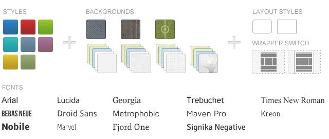
- 8 style variations included
- Choose from 22 backgrounds and 14 fonts
- 4 module styles combinable with 4 badges and 6 icons
- 3 different wrapper styles: White, Glass and None
- Rounded corners option available
- Flexible template and column widths
- All Warp 6.1+ framework features are available
- Including 4 custom Widgetkit styles
Easy Installation and Customization
Demo Packages
We provide demo packages with the theme sample data for Joomla and WordPress to get you started right.
Image Sources
Sliced and editable Adobe Fireworks image source files are available to customize the theme easily.
Theme Styles
We provide different style variations of the default theme. In addition to these styles we added several other style settings like colors and fonts. Combining the different style options allows you to create your own unique theme design.
Theme Profiles
We created some nice theme profiles using the different styles, colors and fonts, you can choose from in the theme administration. You can create your own profiles and even assign them to different menu items. Click on one of the profile images to load it.


Theme Layout
This theme comes with a slightly changed Warp6 module layout. We added a third bottom position called "bottom-c". The blue module positions allow to choose a module layout which defines the module alignment and proportions: equal, double or stack. You can easily add your own module layouts. The two available sidebars, highlighted in red, can be switched to the left or right side and their widths can easily be set in the theme administration. For modules in the blue and red positions you can choose different module styles. Take a look at the module variations page to get an overview.


Special Features
The Revista theme comes with some additional features.
Custom Widgetkit Styles
We created some custom styles for our Widgetkit Slideshow + Widgetkit Slideshow Tabs, Widgetkit Gallery and Widgetkit Slideset, perfectly fitting to the theme. To apply this styles, follow these steps:
Slideshow
- Download and unzip the bonus styles package for Widgetkit available in the download area
- Copy the folder slideshow/styles/revista_articles and slideshow/styles/revista_tabs
-
Joomla: Paste it to media/widgetkit/widgets/slideshow/styles
WordPress: Paste it to wp-content/plugins/widgetkit/widgets/slideshow/styles - Now you can select the style "Revista Default" and "Revista Tabs" in the settings of your Widgetkit Slideshow
Gallery
- Download and unzip the bonus styles package for Widgetkit available in the download area
- Copy the folder gallery/styles/revista_default
-
Joomla: Paste it to media/widgetkit/widgets/gallery/styles
WordPress: Paste it to wp-content/plugins/widgetkit/widgets/gallery/styles - Now you can select the style "Revista" in the settings of your Widgetkit Gallery
Slideset
- Download and unzip the bonus styles package for Widgetkit available in the download area
- Copy the folder slideset/styles/revista_default
-
Joomla: Paste it to media/widgetkit/widgets/slideset/styles
WordPress: Paste it to wp-content/plugins/widgetkit/widgets/slideset/styles - Now you can select the style "Revista Default" in the settings of your Widgetkit Slideset
Social Icons
As a little extra, the Catalyst theme offers a set of social icons. They are easy to add to your content and are part of our editable Adobe Fireworks Image Source Files.
Here is a little code example how to add them:
<ul class="social-icons">
	<li class="rss"><a href="#"></a></li>
	<li class="twitter"><a href="#"></a></li>
	<li class="facebook"><a href="#"></a></li>
</ul>
Possible class names are rss, twitter, facebook, flickr, linkedin, myspace, lastfm, dribbble, digg, delicious, deviantart, technorati, stumbleupon, yahoo, openid, xing, forrst, googleplus, youtube, vimeo, fouraquare and github.
เผยแพร่ใน
Uncategorised
ใช้แท็กคำค้น (Tags) ว่า
วันจันทร์, 01 พฤษภาคม 1554 18:48
Dummy Content
Lorem ipsum dolor sit amet, consectetur adipisicing elit, sed do eiusmod tempor incididunt ut labore et dolore magna aliqua. Ut enim ad minim veniam, quis nostrud exercitation ullamco laboris nisi ut aliquip ex ea commodo consequat. Duis aute irure dolor in reprehenderit in voluptate velit esse cillum dolore eu fugiat nulla pariatur. Excepteur sint occaecat cupidatat non proident, sunt in culpa qui officia deserunt mollit anim id est laborum.
เผยแพร่ใน
Uncategorised
ใช้แท็กคำค้น (Tags) ว่า
วันจันทร์, 01 พฤษภาคม 1554 18:47
Typography
You can create some beautiful content by using some simple HTML elements. The Warp theme framework offers some neat styles for all HTML elements and a great set of CSS classes to style your content. Basic HTML is very easy to learn and this small guide shows you how to use all styles provided by the Warp framework.
Basic HTML Elements
Here is a short demonstration of text-level semanticts. The <p> element creates a new paragraph. It will have some space before and after itself. To turn your text into hypertext just use the <a> element.
Text-Level Semantics
You can emphasize text using the <em> element or to imply any extra importance the <strong> element. Highlight text with no semantic meaning using the <mark> element. Markup document changes like inserted or deleted text with the <del> element or <ins> element. To define an abbreviation use the <abbr> element and to define a definition term use the <dfn> element.
Short List with Links
- YOOtheme - Premium Joomla Templates and WordPress Themes
- Warp Framework - Fast and Slick Theme Framework
- ZOO - Content Application Builder
- Stock Icons - For Web and Print Projects
Quotations and Code
Inline quotations can be defined by using the <q> element
.
The <blockquote> element defines a long quotation which also creates a new block by inserting white space before and after the blockquote element.
To define a short inline computer code use the <code> element. For a larger code snippet use the <pre> element which defines preformatted text. It creates a new text block which preserves both spaces and line breaks.
pre {
    margin: 15px 0;
    padding: 10px;
    font-family: "Courier New", Courier, monospace;
    font-size: 12px;
    line-height: 18px;
    white-space: pre-wrap;
}
Use the <small> element for side comments and small print.
Useful CSS Classes
Here is a short demonstration of all style related CSS classes provided by the Warp framework.
Highlight Content
Drop caps are the first letter of a paragraph which are displayed bigger than the rest of the text. You can create a drop cap using the CSS class dropcap. To emphasize text with some small boxes use <em> element with the CSS class box.
This simple box is intended to group large parts of your content using the CSS class
box-content.This is a simple box to highlight some text using the CSS class
box-note.This is a simple box with useful information using the CSS class
box-info.This is a simple box with important notes and warnings using the CSS class
box-warning.This is a simple box with additional hints using the CSS class
box-hint.This is a simple box with download information using the CSS class
box-download.Use the CSS class dotted to create a dotted horizontal rule.
Tables
Create a zebra stripped table using using the CSS class zebra.
| Table Heading | Table Heading | Table Heading |
|---|---|---|
| Table Footer | Table Footer | Table Footer |
| Table Data | Table Data | Data Centered |
| Data Bold | Table Data | Data Centered |
| Table Data | Table Data | Data Centered |
Definition Lists
Create a nice looking definition list separated with a line by using the CSS class separator.
- Definition List
- A definition list is a list of terms and corresponding definitions. To create a definition list use the <dl> element in conjunction with <dt> to define the definition term and <dd> to define the definition description.
- Definition Term
- This is a definition description.
- Definition Term
- This is a definition description.
- This is another definition description.
Forms
Create a clearly arranged form layout with fieldset boxes using the CSS class box.
เผยแพร่ใน
Uncategorised
ใช้แท็กคำค้น (Tags) ว่า